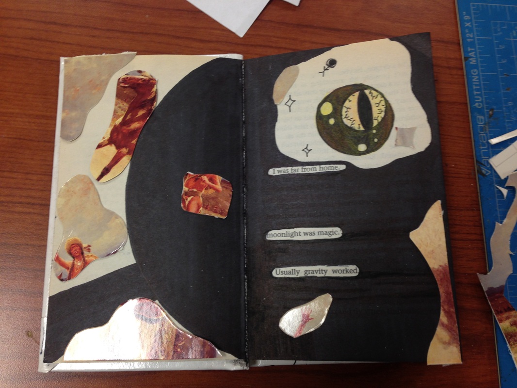
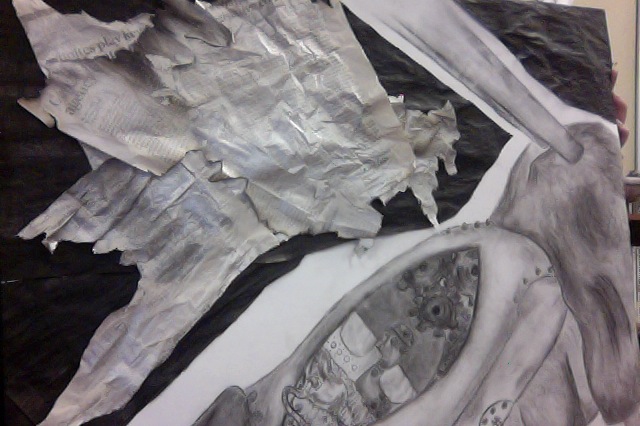
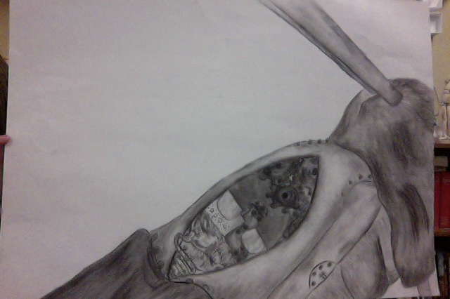
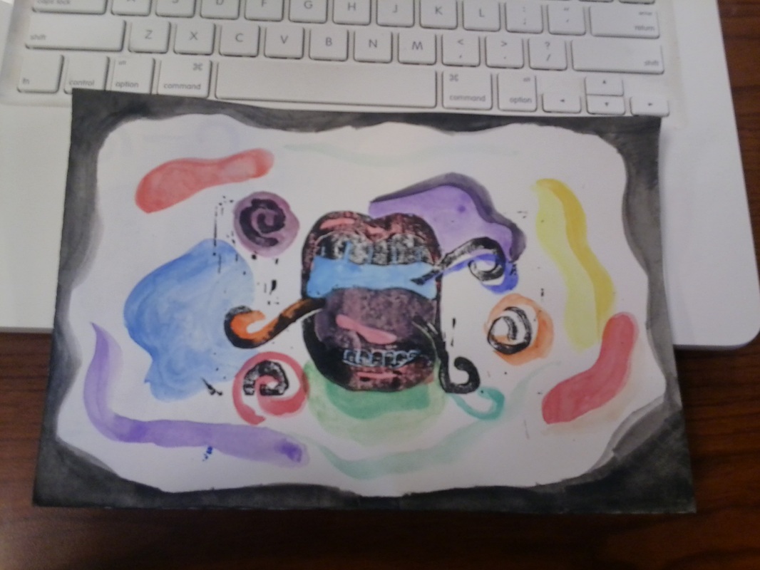
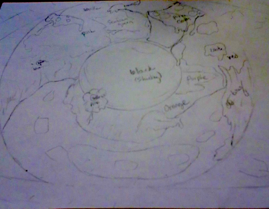
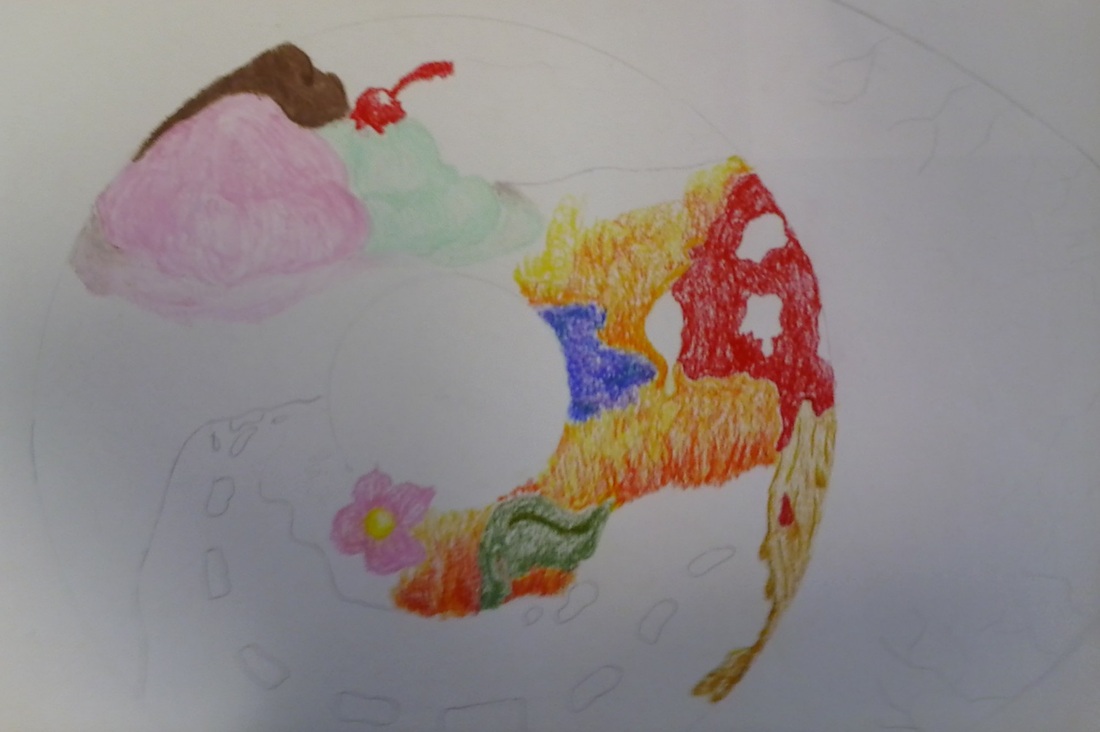
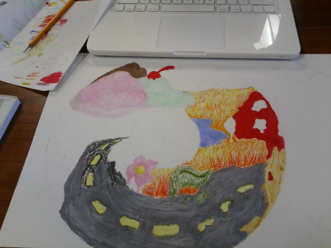
For my most recent page of my altered book I read through several pages until I found interesting words or phrases. The words that aren't covered are the ones I enjoyed and inspired me to a crescent moon. The space I left in the circle looked perfect to put an eye. Next I wanted to black out the rest of the page and leave some white space around the moon to show light. This gave the work an egg type feel and I continued with it turning the back into a frying pan. The theme I used was to incorporate a postcard. I cut it up to look like baconish and abstract still.
I created one page in my altered book using the theme "Layers." My first thought of layering was layering my hands over themselves and morphing them into one. This is shown through my seven fingered hand/turtle. Next, I thought to layer the pages in the book. I represented the folds and layering of flesh present in the female form. I used water color and sepia. I am moderately happy with my work because it is what I imagined it to look like, but I hoped for put together chaos look, incorporating much more to the piece.
Most successful artworkI consider my most successful artwork the interior-exterior themed piece. This is because it was one of my first times using oil pastels and it was my second time using it for a major piece. This is one of my favorites because the iris looks very serene and inviting while the eyes are bloodshot and alarming. I also really liked the texture of the red oil pastel on the mushroom. I colored quite hard to fill in all the white spaces crayons leave usually and it feels and looks waxier than the rest of the piece. This is my most successful because it's that one I am given the most satisfaction from looking at. Finished artwork hanging in hall pictured below. overcoming obstaclesThe artwork I had to overcome the most obstacles to complete is my man verses machine themed piece. I chose this for question two because I had the hardest time deciding what to put in the background to complement my robot man in the foreground. I had several ideas for the background, an abandoned warehouse, a doctor over him, complete darkness, but none of these seemed to satisfy what I needed to make my artwork look complete. I chose burned newspapers in the end. To make these I taped up newspaper a wet it, then it immediately fell down. Next I layer it on the grass and sprayed silver paint on it then burned it. Once it was what I thought was dry I folded it up and put it in a plastic bag to take to school. The next day I opened it and it was extremely stuck together. I salvaged what I could at put it on my artwork. Also, my robot was misplaced in the original sketching period, more diagonal and right than I had wanted and I didn't get over it until an almost to completion checkmark. Pictured below is me holding my completed work in the art classroom. Growth as an artistMy growth as an artist includes finding new mediums, new tools/skills and attention to details. My first artwork of the school year I used charcoal, a medium I have had practice with on a regular basis. While working on this piece Mrs. Barnett allowed me to use the tools in her charcoal box. I choose the use the white smudging pencil, smearing rag, and various types of charcoal other than the usual extremely compact rectangular prism chalk I had used before. These were all first time tools and mediums for me, I practiced on the paper I had begun using for my final piece. On my next artwork I chose to use oil pastel, a medium I had very little practice with and had only used on good paper once; not just notebook paper while doodling. At first I was hesitant that the pastels would give me enough detail that I had originally wanted in my sketch idea, but decided that I would just jump in and see what happens. While wondering how to smooth out my oil pastel marks, I remembered that oil and water don't mix, so I concluded that oil must help the colors blend. I chose baby oil and used it throughout my paper, but mainly on the pupil to make the black look solid and spherical. The above paragraph and below pictures show growth through deviating from my comfort zone and taking risks with my artwork. Pictured below I have my artwork with only the charcoal finished and my other artwork using oil pastel only partly finished. Teaching/learningThis year, Mrs. Barnett has allowed us more freedom in our artwork. This makes it a lot more enjoyable and also somewhat harder because we have to think from scratch instead of just swallowing instructions or guidelines. I think her change in actions was a success and find it swell. I was given more of an opportunity to make my artwork something I was proud of and express my artistic abilities better.
cubbyhole in the art room, interior/exterior project, baby oil for blending, red eyes on computer for reference block print of open mouth with swirls pulled block print + watercolors
Artists Create original art-think creatively -develop original ideas The new theme I am making an artwork under is "Pressure." I started thinking about pressures I personally face or see in day-to-day life. What first came to mind was the stress of school, the pressure placed on me to be social and interact with others, and a cube of solid, condensed air particles. The last one was trashed almost immediately because I couldn't possibly grasp the beauty of science AND explain the pressure behind it and as for the first two anxiety ensued the very thought of those examples of pressure. I began with looking at people stressed out and noticed a common theme: an open mouth, wider than a snake's mouth while eating a baby. I then proceeded with googling "people with open mouths" (and not in the way I usually do ;D). I found inspiration a photo that showed an image of someone with their mouth open so wide their face seemed to disappear completely as they bite backwards onto themselves. What I got from this photo was that the mouth is the focal point of stress and should also be in my artwork. I made a block print of an open mouth with swirl-ys coming out and settling around the mouth. I chose to pull a print off of it in the color black to give pressure a darker sense *ba dum tssss.* Next, I used water colors to decorate the practice print. I wanted my artwork to demonstrate the beauty that can come from being under pressure, so I painted colorful blotches around the print and coming out of the mouth. artists develop art making skills-learn techniques and processes -explore media I used watercolors for the first time on my latest artwork. After a few practice strokes, I noticed that there was a darker pigment where I placed my paintbrush on the paper and where I took my paintbrush from the paper. I was a little concerned about them drying with the darker spots still visible, but I actually liked the way the darker section seemed to lay over the lighter section. I asked a girl in my class, Makayla, to pick the colors for the splotches so they would look less planned out, a fatal flaw of mine. I wet some of the sections before I put the watercolor on to make them look even different.
Artists Take RisksDid you pick a material or technique that was new or different over something that was familiar? Did you try something that you weren't sure about as part of this project? I have begun my second artwork of the school year for art II. The theme for this project is INTERIOR / EXTERIOR and I chose to incorporate an eye as the exterior in my piece and being that eyes are supposedly the windows to the soul, the iris will represent the interior. My beginning sketches were in pencil and then I was reacquainted with oil pastel through a workshop in class from another student. I first used oil pastels two years ago in another art class for a single project. I had first intended for my artwork to be completely composed in pencil, but chose the pastels over the classic. I started with the colored oil pastels using small, sparse strokes for grass. While using my red pastel for the top of my mushroom tree, I noticed my marks had a lot of white gradient, extremely similar to the way crayons draw, and didn't completely enjoy the way it looked. It looked fine, but not exactly what I wanted so I decided to try using white on the red. I was wary at first about using the white pastel on the red because I was concerned about it looking pink and smearing into the surrounding brown and orange. It turned out too light so I stopped before coloring over the whole top. Next, I colored hard over the entirety of the mushroom, making the red look very thick and waxy. This effect was exactly what I wanted. Artists ReflectWhen did you step back and analyze your work during this project? Did you consider how idea would work before you tried them? While making the initial sketch of my interior/exterior artwork, I started off with a completely different iris design. The original idea was two paper cut men holding hands around the iris. Also their legs were turned and crossing each other in a fashion I rather enjoyed. My current idea, I decided to make a fantasy land that is imagined by the eye's owner. One of the aspects inside of the iris were pizza clouds, but while looking the artwork as a whole over I thought they looked cramped and disproportional. Once the pizza clouds were removed, the world looked more spread out and serene in a sort of 'country pastor' kind of way.
Title: The Singing Lute Player
Artist: Hendrick Terbrugghen Completion Date: 1624 Style: Baroque Medium: oil on canvas Dimensions: Height: 100.5 cm (39.6 in). Width: 78.7 cm (31 in). |